Display of Climatix IC on various end devices
The Climatix IC default layout has a responsive design. It supports the display of Climatix IC, in addition to on a PC, on various mobile end devices, such as a mobile phone or tablets from various manufacturers and device sizes.
When starting Climatix IC on mobile end devices with a smaller display than the PC, the Climatix IC layout changes to the size of the device:
- All Climatix IC functions are retained.
- The menu views are displayed in compressed form.
- The menus are displayed as summary under superordinate symbols.
- The menu navigation changes depending on the level of display compression.
- But the fundamental logic of the menu navigation remains the same.
- Menu navigation on mobile devices is intuitive.
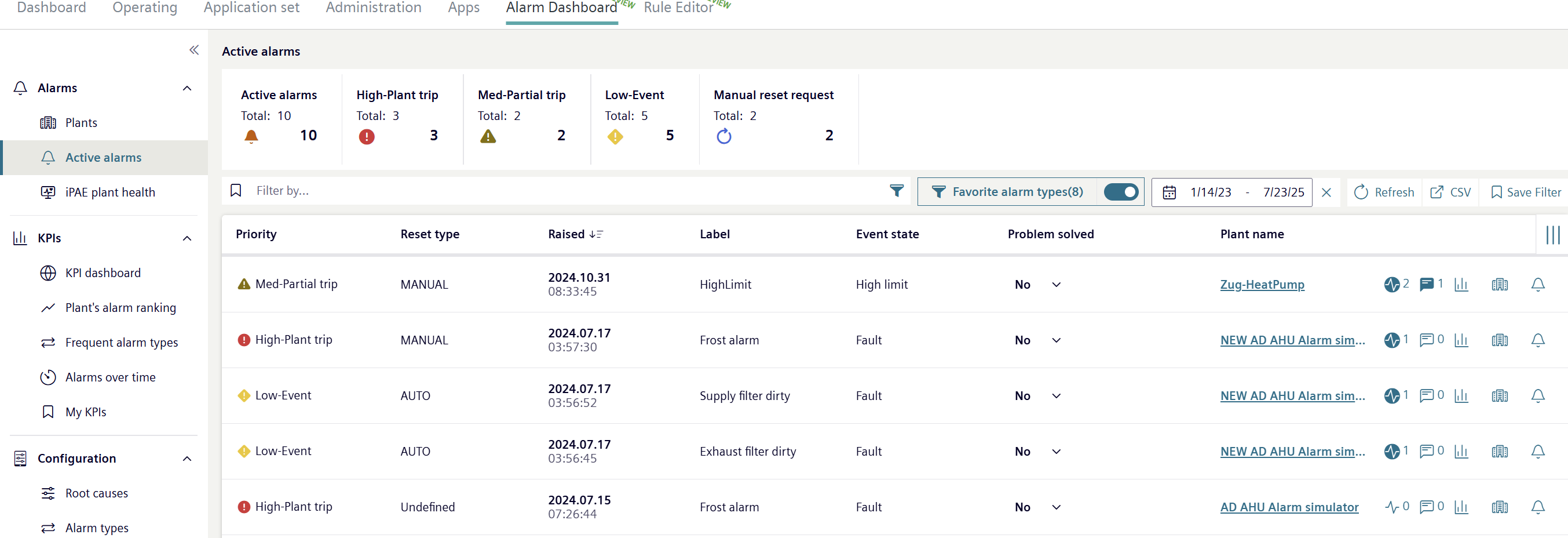
Example of a menu view on a computer screen:
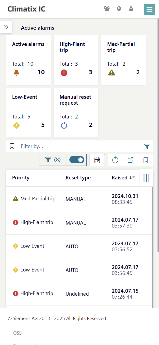
The same menu on a mobile device:
Menu navigation in this document
To simplify navigation of this document, it follows the menu navigation as displayed on the PC. Menu navigation on mobile end devices with a smaller display can be derived from this documentation.

Individual menus from Climatix IC cannot be fully adapted to the responsive design. In this case, the menus are not correctly depicted on the mobile end devices.
- Start Climatix IC on a PC.
- Opens with the required menus to conduct the workflows.
- As needed: Switch back to the mobile end device to continue the work.
Customized Climatic IC layouts are not adapted to the responsive design. The display on mobile end devices is not supported for these layouts.
- To adapted customized layouts to a responsive design: Contact Climatix IC support.