KPI Dashboard
The KPI↑ Dashboard has different functions for a quick visual overview of alarms:
- Filtering alarms.
- Filtering alarms by Tenant.
- Number and status of alarms.
- Geographic location of your plants on a map.
- Direct access to the plants with an alarm from the Dashboard.
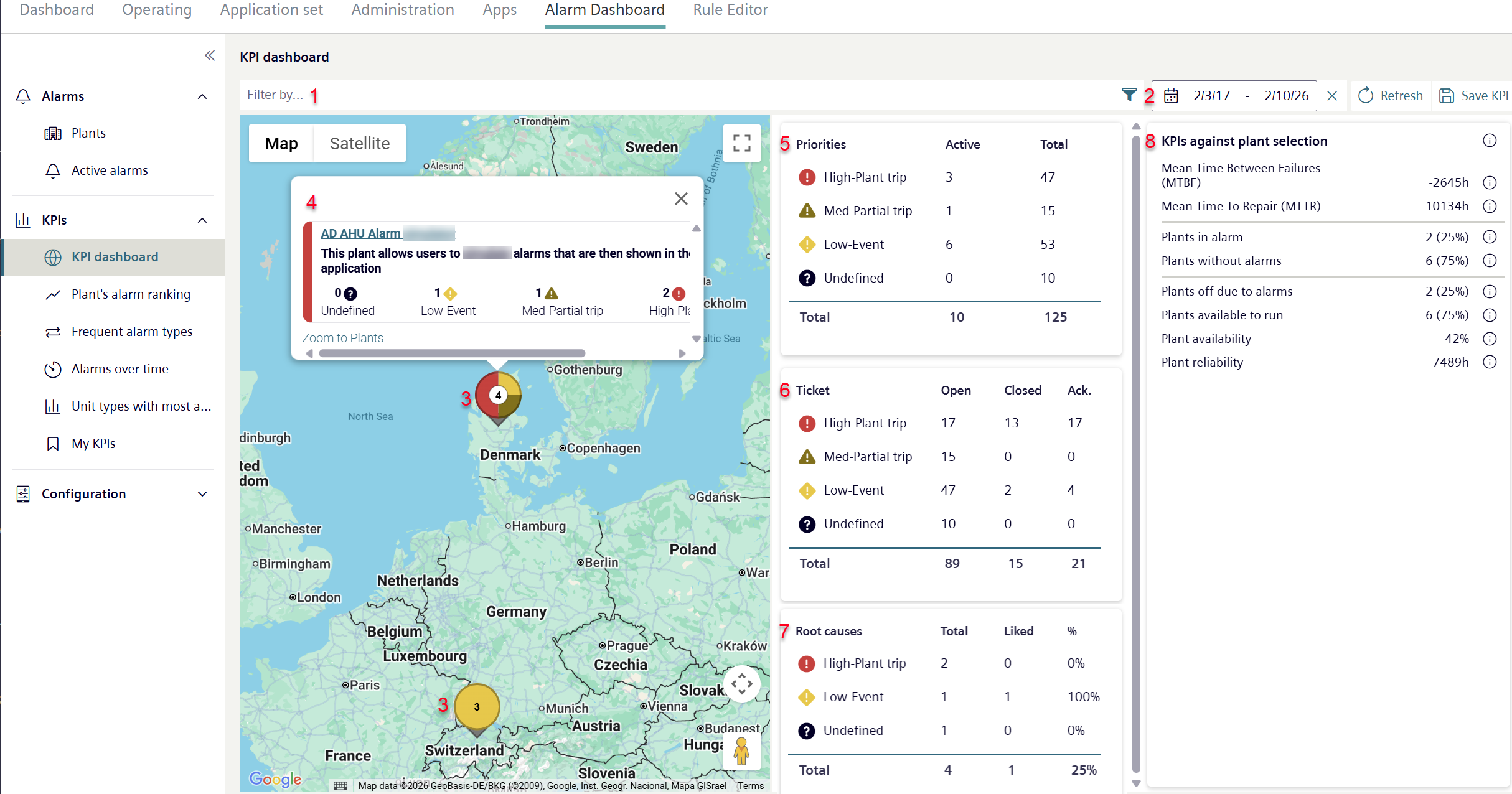
- Go to "Alarm Dashboard > KPIs > KPI Dashboard".
- Select one or more desired plants using the filter (1).
- A new window 'Advance filter search' opens.
- Filter by plants (see 'Advanced filter search by plants with an alarm').
- Enter the period (2) to display the alarm types.
- The larger the period, the higher the probability of finding alarm types with alarms.
- The filtered plants are displayed in an integrated Google map.
- The plants are displayed on the map in a pie chart (3). Multiple plants at one location are grouped.
- The color distribution stands for the number of alarms by priority, the number is the total number of plants at a single location.
Move the cursor over the plant to display the number of a alarm types by priority. - Click a pie chart.
- A pop-up (4) opens on the map with plant details, depicted in a pie chart.
- A pop-up displays for each plant stored in the pie chart with plant name, plant description, and the number of alarms by priority.
- Click the plant name in the pop-up to change the Plant Dashboard.
- The "Operation" menu opens in a new window and displays the Plant Dashboard.
- Displays a summary of all alarm types previously found using the filter and time function broken down by priority and status (5).
- Displays a summary of all tickets↑ broken down by status and priority (6). On how to set ticket status: See 'Intelligent Alarm Application (IAA) user interface'.
- Displays a summary of all root causes with the number of 'Likes' by priority (7). It considers are applied filters within the Intelligent Alarm Dashboard. To set 'Likes': See 'Causes'.
- Displays a statistical evaluation of previously selected alarms as KPIs (8).
- Click ' Save KPI'.
- A new menu window opens to save the selected KPIs.
- Proceed as described in 'Saving KPI bookmarks'.
- The selected KPIs are saved and can be queried in the 'My KPIs’ menu.
KPIs against plant selection
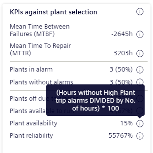
View 'KPIs against plant selection' display general KPIs, for each current data value. The displayed KPIs always refer to previously filtered plants by the user. They display a statistical evaluation of specific parameters of the selected plants.
For information on the displayed KPIs:
- Move the mouse point over the info icon
 for an KPI.
- A pop-up displays with information on the KPI.